Block Supports
When blocks [ including core blocks ], offer similar customizations, then instead of writing the code again and again for the same functionality, we can use the block support -> they are similar to theme support -> they are used to enable some predefined functionality.
For example.
To simply enable the text color for our block we can use this in our code
"supports": {
		"color": {
			"text": true,
		}
	}
The supports parameter has to be defined in our block.json, our block.json would look something like this
{
	"$schema": "https://schemas.wp.org/trunk/block.json",
	"apiVersion": 2,
	"name": "create-block/gutenpride2",
	"version": "0.1.0",
	"title": "Test block",
	"category": "widgets",
	"icon": "smiley",
	"description": "Example block scaffolded with Create Block tool. 2",
	"supports": {
		"html": false
	},
	"textdomain": "gutenpride",
	"editorScript": "file:./index.js",
	"editorStyle": "file:./index.css",
	"style": "file:./style-index.css",
	"attributes": {
		"aryan": {
			"type": "string",
			"default": "something"
		}
	},
	"supports": {
		"color": {
			"text": true,
			"background": true,
			"link": true
		}
	}
}
Now this would give us
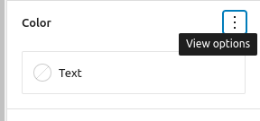
This section in our block panel, and we can control our text color as simple as that.
Some different block supports are:
"supports": {
		"anchor": true,
		"align": true,
		"alignWide": true,
		"className": true,
		"color": {
			"background": true,
			"__experimentalDuotone": false,
			"gradients": true,
			"link": true,
			"text": true
		},
		"customClassName": true,
		"defaultStylePicker": true,
		"html": true,
		"inserter": true,
		"multiple": true,
		"reusable": true,
		"spacing": {
			"margin": true,
			"padding": true
		},
		"typography": {
			"fontSize": true,
			"lineHeight": true
		}
},- align -> This is used to change block’s alignment.
- alignWide -> This property allows to enable wide alignment for our theme
- className -> this can be used to remove the default
.wp-block-your-block-nameclass - color -> change color for diff properties for e.g. text, bg etc.
- customClassName -> allows us to define a custom className for the block’s wrapper
- typography -> allows us to change the typography for the block.
For the dynamic block we can get the data in the get_block_wrapper_attributes(); and use it from there.
We need to add the supports while registering the block in php as well
register_block_type(
        'our-blocks/our-custom-block',
        array(
            'api_version'       => 2,
            'supports'          => array( 'color' => true ),
            'render_callback'   => 'our_render_function',
            'skip_inner_blocks' => true,
        )
    );
Attributes
To make sure our edit function renders the same data every time we must make use of the attributes, attributes is used to save some data in blocks.
It can be used to maintain the representation of the block via js
Now if we need to use the attributes and save them we must first define them in our block.json file
To define a attribute we can simply follow this code
url: {
        type: 'string',
        source: 'attribute',
        selector: 'img',
        attribute: 'src',
    },
    title: {
        type: 'string',
    },
    size: {
        enum: [ 'large', 'small' ],
    },
Now for example if we want to register a attribute named aryan, our code would look something like this
{
	"$schema": "https://schemas.wp.org/trunk/block.json",
	"apiVersion": 2,
	"name": "create-block/gutenpride2",
	"version": "0.1.0",
	"title": "Test block",
	"category": "widgets",
	"icon": "smiley",
	"description": "Example block scaffolded with Create Block tool. 2",
	"supports": {
		"html": false
	},
	"textdomain": "gutenpride",
	"editorScript": "file:./index.js",
	"editorStyle": "file:./index.css",
	"style": "file:./style-index.css",
	"attributes": {
		"aryan": {
			"type": "string",
			"default": "something"
		}
	},
}
We can also set the default value for it, for example we have set something here.
Now in the initial stage when there is no value of aryan defined, the value would be something.
The type in the attributes must be of the following values
nullbooleanobjectarraystringintegernumber=integer
The source method in attributes -> it is used to define from where the value in the attributes must be taken. Some valid values for source would be:
- empty -> The value is stored in the comments of the block markup
attribute-> The value is stored in html element attribute.text-> The value is stored in HTML text.html-> The value is stored in HTML.query-> The value is stored as an array of objectsmeta-> The value is stored in post metadata.
Now in our code we can use setAttributes function as well to change the value of attributes
<TextControl
						label={__('Setting 1', 'gutenpride')}
						value={attributes.setting}
						onChange={
							(setting) => {
								setAttributes({ aryan: setting });
							}
						}
/>
Block Controls
There are two kind of controls we can modify for our blocks
- Block Toolbar
- Settings Sidebar
Block Toolbar
The block toolbar appears on the selected block with some controls when the user has selected the current block. In the block toolbar some controls are automatically added by default if when the block can be converted.
This toolbar also displays several typography controls if the block supports and and if the block is having richText component
Settings Sidebar
The block also supports related settings in the right sidebar we have under the tab Block, here we can add the settings which are not immediately required when we are editing our block, for example we can add categories or settings which are applying to the whole block.
To add settings to the Settings Sidebar we can use the format below
<p {...useBlockProps()}>
			<InspectorControls>
				<PanelBody
					title={__('Test settings', 'gutenpride')}
					id='test_id'
					initialOpen={true}
					icon='admin-appearance'
				>
					<TextControl
						label={__('Setting 1', 'gutenpride')}
						value={attributes.setting}
						onChange={
							(setting) => {
								setAttributes({ aryan: setting });
							}
						}
					/>
				</PanelBody>
			</InspectorControls>

		</p>
The inspectorControls would add them to the sidebar.